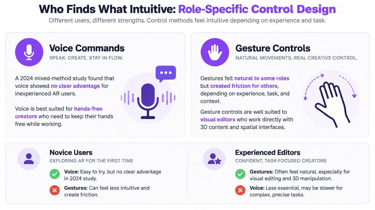
There is no single best control scheme, because intuitive controls vary by user and task. In a 2024 mixed-method study, inexperienced AR users showed no significant overall usability difference between voice and gesture controls, although gestures suited playfulness and voice suited efficiency.
You may recognize the problem from your own workflow. You open a karaoke editor with a week's worth of songs waiting, upload the first track, and then start searching for the lyric field. The timing controls are hidden behind another panel, the preview requires a separate render, and a simple font change sends you into a settings maze. By the time the first video is ready, the creative work has barely begun.
That frustration isn't a failure of patience. It's a sign that the controls don't match the creator's experience, role, device, or immediate task. Intuitive controls should feel familiar for the person using them in that moment, not merely look clean to the product team that designed them.
Why Intuitive Controls Matter for Karaoke Creators
A karaoke creator rarely completes just one isolated action. The workflow usually moves through several connected decisions: add the song, provide lyrics, align each line, choose a visual style, review playback, and export. If each step uses a different interaction pattern, the creator must repeatedly stop producing and start interpreting the interface.
Consider a channel manager processing a queue of songs. They don't want to rediscover the location of the upload button every time. They want the application to preserve familiar expectations: a file belongs in an upload area, lyrics belong beside the track, a timeline represents duration, and a play button starts the preview. Those conventions reduce the mental translation between “what I want to do” and “what the interface allows me to do.”
The cost of poor controls appears in small interruptions:
- Hidden next steps: The user uploads a track but can't tell whether lyrics should be pasted, imported, or typed manually.
- Unclear timing feedback: A lyric line moves, but the preview doesn't show whether the change affected the right moment.
- Separated decisions: Font, color, background, and playback settings live in unrelated screens.
- Weak recovery: An accidental drag or edit has no obvious undo path.
Practical rule: A creator shouldn't need to understand the software's internal structure before completing a familiar editing task.
Karaoke production makes this especially important because timing is both visual and auditory. A creator needs to hear the song, see the lyric line, and understand the position of that line on the timeline. Controls that support those three perspectives together preserve attention. Controls that force constant panel switching fragment it.
A clear workflow also helps teams compare tools responsibly. Resources on a pro video creation workflow can help creators think about the broader production process, but the interface still has to make each action understandable at the moment it occurs. For a browser-based tool, even the first file-selection step matters. A creator should also be able to review guidance on drag-and-drop uploading without losing the logic of the main workflow.
The result is more than convenience. Natural controls protect creative momentum. When users can predict what a button, handle, or gesture will do, they spend their attention on lyric presentation and audience fit rather than on software archaeology.
The Research Behind Intuitive Interaction
Researchers don't define intuitive use as magic or instinct. The foundational early-2000s work described it as applying prior experience to use an interface easily and quickly, often without consciously tracing where that knowledge came from. A later review explains that related research developed separately in Australia and Germany and that Blackler, Mahar, and Popovic connected intuitive use with technology familiarity through experiments. The historical review of intuitive interaction also records forty-five uses of “intuitive” or “intuitively” in Apple's Human Interface Guidelines.
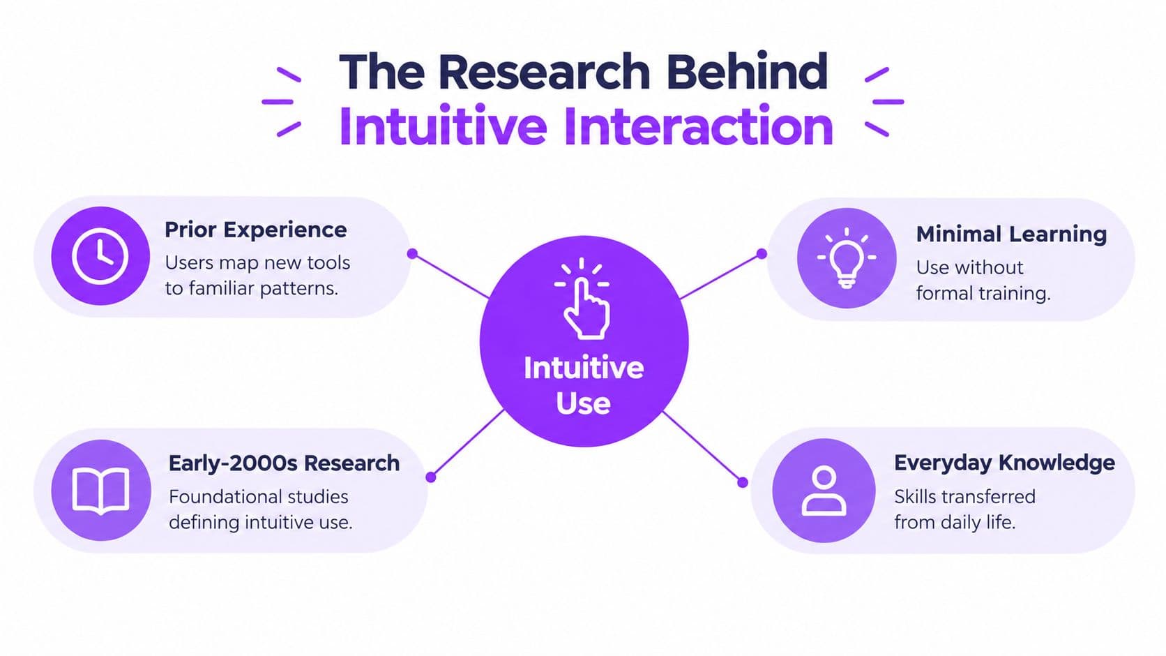
That history gives designers a more useful starting point. A control feels intuitive when it connects a new action to something the user already understands, such as dragging a block to change its position or pressing play to inspect a result. The interface still needs to make the relationship visible, but the user doesn't have to build the entire mental model from scratch.
Familiarity matters more than novelty
Evidence from mapping studies complicates the idea that one visual metaphor always wins. In one study, overall differences in usability, intuitive interaction, and engagement weren't statistically significant across mapping strategies, although metaphoric mappings produced significantly higher T2 scores than isomorphic mappings. Another design study found that previous exposure to products with similar features helped participants complete tasks more quickly and intuitively, while familiar features were used intuitively more often than unfamiliar ones. The mapping and familiarity research supports a practical conclusion: reuse conventions when they fit the task.
For karaoke tools, this means a timeline shouldn't behave like an unusual canvas just because the product wants to look distinctive. A creator who has used video editors already understands tracks, playheads, scrubbing, and draggable segments. Those familiar relationships can make lyric synchronization easier to learn than a novel interaction that requires special instructions.
Input changes the experience
Input method also affects how intuitive an action feels. In a 48-participant experiment, touch input significantly improved speed and accuracy compared with mouse input and increased reported competence, control, and immersion. The researchers described intuitive controls as interactions that don't interfere with presence, are easy to master, and make sense in context. The touch and mouse experiment is relevant to creators editing on phones and tablets, not only to desktop software.
That doesn't mean touch is always the right answer. It means designers should test the relationship between the action and the input method. Dragging a lyric boundary may feel direct on a touchscreen, while precise keyboard nudging may suit a batch editor working through many songs. Intuition belongs to the complete situation, not to the control in isolation.
Design Patterns That Make Karaoke Tools Feel Natural
The strongest karaoke interfaces guide creators through a visible chain of decisions. Each control answers a question the user already has, such as “What do I upload?”, “Where does this lyric line start?”, or “What will the finished video look like?”
Start with an upload flow that confirms progress
An effective upload area supports both dragging a file and choosing one through the device's file picker. After selection, it should acknowledge the file clearly, show that processing has started, and expose the next relevant action. The creator shouldn't have to guess whether the track was accepted or search through menus for the lyric step.
The next screen should preserve context. Keep the song identity visible, place the lyric input near the track, and make errors specific. “Audio format not supported” helps the user recover. A vague failure message doesn't.
Put timing, sound, and text in one editing view
Synchronization becomes easier when the waveform, lyric blocks, playhead, and playback controls share the same working area. A creator can listen to a phrase, locate its visual position, and drag the corresponding lyric line without holding several separate screens in memory.
Useful controls include:
- Draggable timing boundaries: Let users move the start and end of a lyric segment directly.
- Fine adjustments: Provide keyboard or small-step nudges for moments that need precision.
- Visible playback state: Make play, pause, and scrubbing obvious while edits are underway.
- Immediate feedback: Update the preview quickly enough that the user can verify the change before continuing.
A scrolling text maker illustrates why text movement and timing should be treated as connected design problems. The creator isn't only formatting words. They're deciding how those words appear in relation to music and attention.
Show visual changes while the creator makes them
A font selector that changes nothing until the user opens another dialog creates uncertainty. The creator has to remember the chosen option, move elsewhere, and judge the result later. A live preview removes that memory burden.
Organize customization by the order people normally decide:
- Choose the lyric treatment.
- Adjust font and size.
- Set colors and emphasis.
- Pick a background or visual layer.
- Review the result during playback.
This sequence is more useful than alphabetical organization because it follows the creator's mental workflow. It also gives advanced options a sensible home without making beginners confront every setting at once.
Tools that support broader AI workflows for video reinforce the same principle. Automation can reduce repetitive work, but the creator still needs understandable controls for reviewing, correcting, and approving the result. An automated action isn't intuitive if its effect is hidden.
A preview isn't decoration. It is the creator's evidence that the last action worked.
Who Finds What Intuitive Role-Specific Control Design
The phrase “intuitive control” often hides an important question: intuitive for whom? A casual creator making a birthday video may want a guided sequence with large, obvious actions. A channel manager processing a large queue may regard those same prompts as friction.
Research with inexperienced AR users makes the point clearly. A 2024 mixed-method study found no significant difference in overall usability or user experience between voice commands and gestures, but preferences split by purpose. Participants preferred gestures for playfulness and voice for efficiency. The study of voice and gesture preferences therefore challenges the search for one universally intuitive control.
Match controls to the creator's role
| Creator role | Controls that may fit the workflow | What to avoid |
|---|---|---|
| Batch editor | Keyboard shortcuts, bulk actions, reusable styles, compact navigation | Repeating guided prompts for every file |
| Casual social creator | Step-by-step guidance, touch-friendly buttons, visible previews | Exposing advanced settings before they're needed |
| Musician or lyric creator | Direct lyric editing, precise timing, clear audio playback | Hiding timing details behind decorative controls |
| Event organizer | Fast templates, predictable export actions, simple replacement of text | Requiring deep editing knowledge for routine changes |
These are not rigid user categories. One person may switch roles from one project to the next. A musician preparing a single announcement needs a different pace from that same musician preparing a catalog of lyric videos.
Progressive disclosure helps accommodate the variation. Show the common path first, then reveal advanced controls when the user asks for them or reaches a task that needs them. Keyboard shortcuts can coexist with visible buttons. Touch gestures can complement, rather than replace, direct manipulation. Voice input may help a hands-busy creator, while a visual editor may prefer precise pointer control.
A role-specific approach also changes how teams evaluate products. Instead of asking whether an interface is intuitive in general, ask whether a particular creator can complete a particular task with the device and experience they bring. Someone comparing options can use a guide to karaoke software as a starting point, then test the workflows that match their actual responsibilities.
Better question: Which control reduces effort for this creator, at this stage, on this device?
Accessibility and Mobile Controls for Every Creator
A visually minimal interface isn't automatically intuitive. If a control is hidden, too small, unlabeled, or unavailable to keyboard users, it may work for a sighted mouse user while remaining opaque to someone using speech input, a screen reader, or a touchscreen.
Harvard accessibility guidance says interactive elements need a clear accessible name, role, and state. It also warns that when a visible label differs from the accessible name, speech-input users may encounter an “unknown hidden command.” The same guidance recommends touch targets of at least 44 by 44 pixels. Harvard's accessibility guidance provides a useful test for whether a supposedly simple interface is understandable.
Compare visual simplicity with operational clarity
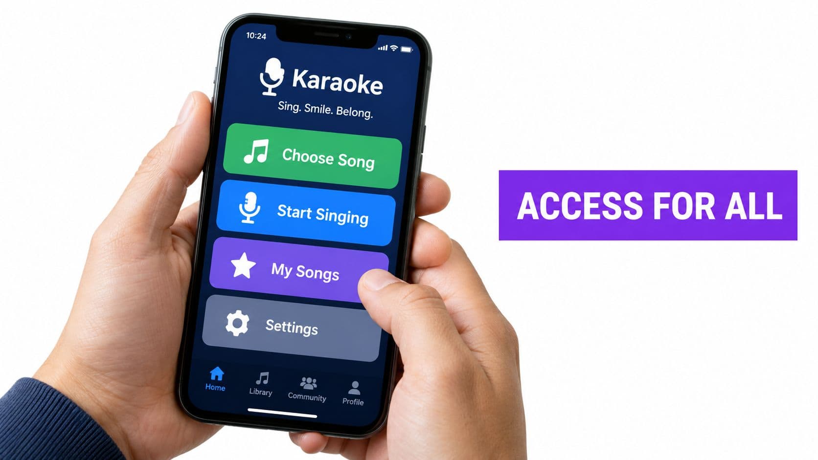
A compact icon-only toolbar may look elegant, but labels often make actions easier to discover. A paintbrush icon could mean text color, background styling, or visual effects. A descriptive label gives the control a predictable meaning, especially for new users.
For a karaoke editor, accessible design should include:
- Keyboard order: Move from song information to lyrics, timing, preview, customization, and export in a logical sequence.
- Visible focus: Make the currently selected button, field, or lyric block easy to identify.
- Accessible names: Label controls according to the action they perform, not an internal component name.
- State announcements: Expose whether playback is paused, a panel is open, or a lyric line is selected.
- Readable contrast: Keep lyric text distinguishable from its background during editing and playback.
- Touch space: Give drag handles and playback controls enough room for deliberate use on smaller screens.
Mobile creators need more than a desktop layout compressed into a narrow viewport. Scrubbing must remain controllable, lyric lines must stay legible, and customization panels should avoid covering the preview entirely. A creator editing a social video on a phone may prefer a single focused action at a time, while a desktop editor may need simultaneous access to timeline and style controls.
Testing should compare both approaches. Ask a user to complete the same task with a mouse, keyboard, and touchscreen, then observe where the interaction breaks down. Satisfaction comments help explain the problem, but task completion shows whether the control works.
Measuring Intuitiveness Through Testing and Metrics
People often call a tool easy because they eventually completed the task. That answer can hide a long sequence of guesses, reversals, and accidental clicks. A stronger evaluation combines what users do with what they say.
Start with a representative workflow: upload a song, add lyrics, synchronize lines, customize the appearance, preview the result, and export. Observe whether first-time users can complete it without opening help documentation. Record where they pause, backtrack, misinterpret a control, or abandon the task.
Use several signals together
Task success tells you whether the workflow can be completed. Time to completion shows how much effort the path demands. Error patterns reveal whether users are misunderstanding the interface or working slowly. Satisfaction feedback explains how the experience felt, but it shouldn't stand alone.
Useful measures include:
- Workflow completion: Did the user finish upload, sync, customization, preview, and export?
- Action discovery: How quickly did they find a common control without prompting?
- Timing accuracy: Did lyric blocks land where the user intended?
- Recovery quality: Could they undo or correct a mistake without restarting?
- Cross-device consistency: Did the same concept remain understandable with touch, mouse, and keyboard input?
Think-aloud sessions add the missing detail. A creator may say, “I'm looking for where the lyrics go,” before clicking the wrong panel. That sentence reveals a discoverability problem that a final satisfaction score might miss.
For later releases, compare the same tasks with the same audience profile. If completion improves but errors shift from uploading to exporting, the interface hasn't solved the workflow. It has moved the confusion. Test role-specific groups separately, because a change that helps casual creators may slow experienced batch editors.
Measure the user's path, not just the user's opinion.
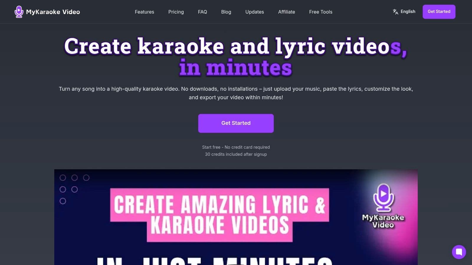
MyKaraoke Video offers browser-based creation with music upload, lyric input, synchronization editing, customization, real-time preview, and export in one workflow. If you want to apply these principles to your own karaoke projects, visit MyKaraoke Video and test whether its controls fit the way you create, review, and publish videos.