The song is synced, the background clip looks right, and you've just spent twenty minutes choosing a typeface with real personality. You export, watch it on your laptop, and it's lovely. Then the file goes to your phone and the second verse vanishes into the bright part of the chorus. Nothing changed except the screen, and that's the whole lesson. On a lyric video, the font isn't a style pick. It's the thing that decides whether a stranger can sing along at 11pm on a phone with the brightness turned down.
So the order matters. Layout comes before typeface, coverage comes before style, and testing comes before you save anything. Here's how to run that sequence without redoing work.
Font Settings That Keep Lyrics Readable
A lyric line has to pass a readability test on the screen in front of the singer. A phone at arm's length, a television across a room, and a bright venue screen each shrink or wash out type in a different way. The floors below are the minimum room a line needs before you choose a face.
| Setting | Minimum guideline | Example at 40 px lyric text |
|---|---|---|
| Line height | at least 1.5 times font size | about 60 px between baselines |
| Paragraph spacing | at least 2 times font size | about 80 px between verse blocks |
| Letter spacing | at least 0.12 times font size | about 4.8 px |
| Word spacing | at least 0.16 times font size | about 6.4 px |
| Contrast, normal text | 4.5:1 against background | check the weakest frame with a contrast picker before export |
| Contrast, large text (18 pt regular or 14 pt bold) | 3:1 against background | same check, lower bar |
| Resize | content usable at 200% enlargement | preview in a player at double size |
Those spacing floors come from WCAG's Text Spacing success criterion (1.4.12): line height at least 1.5 times the font size, paragraph spacing at least 2 times the font size, letter spacing at least 0.12 times the font size, and word spacing at least 0.16 times the font size. The 40 px column is that same rule worked out on a typical lyric size. Separately, text has to stay usable when enlarged to 200 percent, with reflow addressed up to 400 percent zoom on small screens, as set out in the W3C's resize text guidance.
Spacing works like lane markings on a fast road. Enough gap and the eye can pick up the next syllable while the track keeps moving. The letter-spacing floor looks like almost nothing in a settings panel, and on screen it reads as a clean line. Double it and short words break into separate letters, which slows recognition exactly when someone is trying to follow a fast chorus. Repeated refrains and one-word lines usually need more room than the floor, not less.
Contrast carries the other half of the job, and a still frame will lie to you. A pale gold lyric over a moving sunset can clear the contrast rows on the dark frames and fail the moment the sky brightens. On a phone with the brightness turned down, that failure hides the second verse. On a television across a room, a thin face loses the same fight. In a bright venue the background behaves like a moving spotlight, so check the weakest frame, not the prettiest one, and use the lower bar in the table only when the lyric is large or bold.
Practical rule: treat every figure here as a floor. Repeated refrains, fast syllable-level highlights and one-word lines usually need more room, not less.
Finish with a preview, not a guess. Confirm each line breaks where you expect, nothing clips or overlaps at the output size, and the text stays readable when you enlarge the player to double size.
Customize Fonts in MyKaraoke Video Step by Step
A new chorus looks fine on a laptop, then falls apart the moment you check it on a phone held at arm's length. The typeface was readable in the editor. The order of the decisions was not. Work from layout to final playback so each later setting has a frame it can fit.
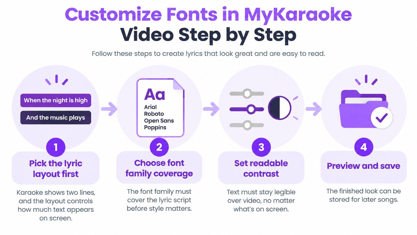
- Pick the lyric layout first. The layout decides how much text has to share the frame, and switching it later rebuilds every line break. Karaoke shows two lines at a time, with each word filling in as it is sung and a countdown before every verse. Single shows one line at a time, big and centred, with the current word highlighted. Scrolling moves the lyrics up the screen, the current line in focus and the next ones already in view. Dual Language shows every line in two languages, with an AI translation under the original. Duet is the fifth layout. Choose it here if the song needs it, before you lock type size.
- Confirm the family covers every character in the song. A missing glyph forces a fallback face with different widths, which rewraps the line you just spaced.
- Give each text role one face. Title, lyric line and credits each get a single job. Choosing from over 1,500 fonts is easier once you know you need three faces, not twelve.
- Set size and weight. Lyric text has to survive a phone at arm's length, a television across a room, and a bright venue screen. Start larger than feels comfortable on your monitor, then trim.
- Set text, wipe and outline colours. The sung part has to stand clearly apart from the unsung part, and both need to hold against whatever is moving behind them.
- Open up the spacing. Adjust line and letter spacing, then check the wrap again. Tracking that looked generous on a short line can push a long one onto a third row.
- Sync the words. Drag any word's edge so it lands on the beat, then use 10 ms nudges for the last adjustment. Colour comes before this step for a reason: a highlight you cannot see makes a well-timed wipe look late.
- Watch it at export size. Play a verse and a chorus at 1080p, on the frame size you will publish, before you commit.
Where new creators lose time: changing the font before deciding the layout. The typeface survives that switch. Every line break and wrap does not.
Set one lyric animation after the colour step, then stop. Karaoke and Single take a left-to-right wipe or a per-word fill locked to the sung word. Scrolling takes a short fade on the line that enters. Bounce, shake, and a second effect stacked on the same line all compete with the words. Play a fast chorus and confirm the highlight finishes when the word finishes.
Then run three checks on the finished frame. Full lines readable at the output size, including descenders on letters like g and y. Highlight visible against both the sung and unsung colour, not only against each other. No clipped words at the frame edges on the longest line in the song.
Choose a Font Family That Covers Your Lyrics
Coverage is the test that happens before style, and it's the step most creators skip. A family that renders a beautiful English line can be missing Arabic, Devanagari or Cyrillic glyphs entirely.
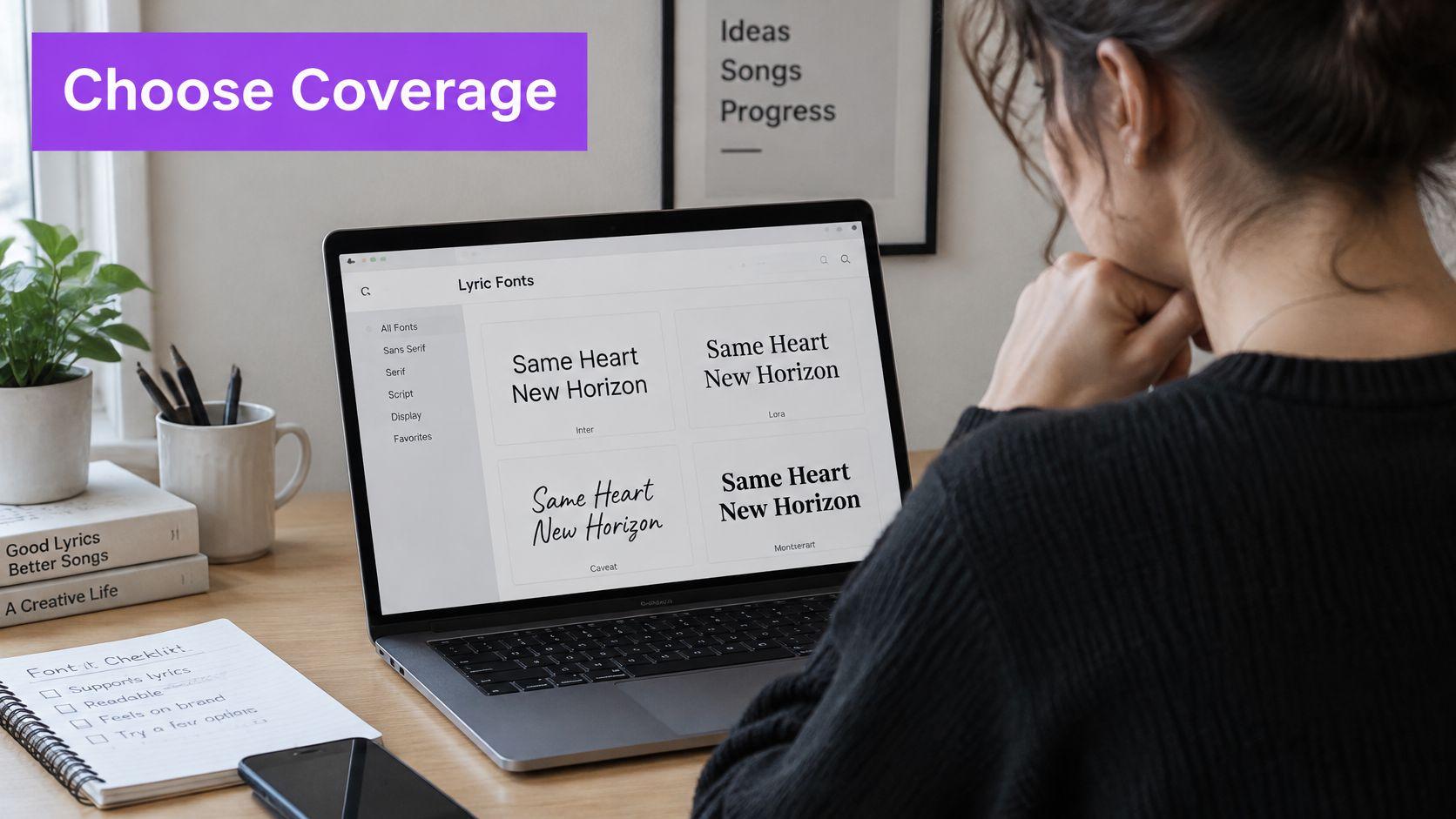
Run the family through three checks before you commit to it. Does it carry every character in the lyric sheet, including accents, numerals and punctuation? Have you decided which face does which job, so the title, the lyric line and the credits don't fight? And does it hold up on both a two-word line and a fifteen-word line?
The failure nobody notices until export: a Latin font without the script you need makes the system substitute another face. That fallback may share the look but not the x-height, baseline or width, so the line rewraps and the karaoke highlight lands on the wrong syllable.
Take a song with an English title and Hindi lyric lines. Set the title in the display face you want, set the Devanagari lines in a family built for that script, and preview both at the export size before building anything else. If the Devanagari face carries a taller x-height, its lines will sit higher in the frame and the wipe will read slightly behind the singer. That's a line-box fix you make once, not a per-word correction.
This is also where modern font files earn their place. The 2025 Web Almanac reports that 39.4 percent of desktop websites and 41.3 percent of mobile websites used at least one variable font, according to the HTTP Archive's fonts chapter, so the axis-based approach is now mainstream rather than experimental. For lyric work, the practical caution is that a condensed or very thin setting saved as a variable instance can lose strokes to video compression, so judge the exported file, not the settings panel.
Transcription is most reliable in widely spoken languages, so for a less common language paste your own lyrics first and then pick the face that matches the text you have. If you also publish captioned versions of the same song, the thinking overlaps with choosing a good subtitle font for small screens.
The working rule for mixed-language lyrics is one lyric family per language, then a wrap check on every line before export.
Contrast and Outlines for Busy Video Backgrounds
Outline, shadow and background panel decide whether text survives a busy frame, and none of them work as an afterthought to colour. The threshold is the same one that governs the rest of the frame: 4.5:1 for ordinary lyric text and 3:1 for large text, which the Section 508 contrast baselines define as at least 18-point regular or 14-point bold. A thin decorative face in a pale tint fails those ratios long before the nominal font size looks wrong.
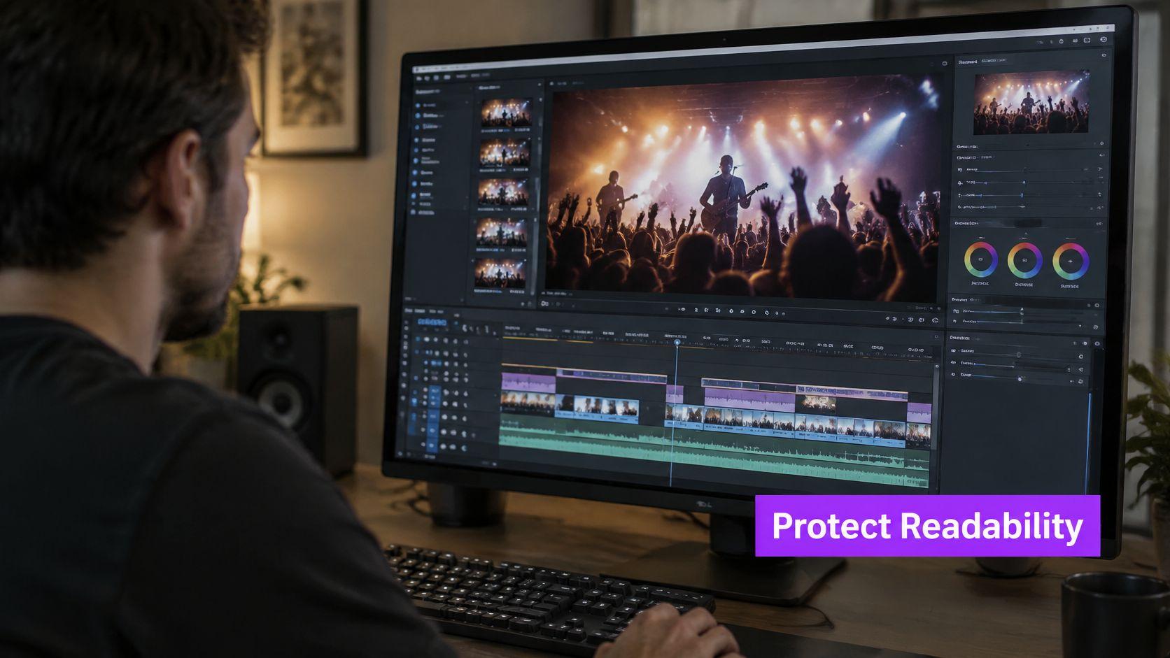
Reach for the fixes in the order you'll need them.
- A bold or medium weight for the lyric font, so strokes are thick enough to survive compression before any effect is added.
- A contrasting outline thick enough to stay visible after the video is encoded, since a hairline outline disappears first.
- A soft shadow under light text sitting over bright footage, which separates the letterform without hardening the edge.
- A semi-opaque text panel behind the lines when the background is a photograph, a gradient or fast-cut video.
Pale gold lyrics over a sunset clip are the classic case. They pass on the dark opening frame and fail when the sky blows out two lines later, and the fix is a panel, not a bigger font. The sung and unsung colours need the same treatment: the wipe colour has to contrast with the unsung colour, and both still have to meet the ratio against the background rather than only against each other.
The test that catches this: scrub the timeline and look at the darkest and brightest frame underneath each line. A single still frame will approve a lyric video that fails in motion.
If the frame is very busy and outlines aren't enough, the panel is doing more work than any typography setting. There's a longer explanation of that trade-off in this guide to high contrast text on video if you want to go deeper on background separation.
Font Choices for Phones, TVs and Venue Screens
The same lyric passage reads differently in a hand, across a lounge and on a projector in a bright room. Here's where each setting earns its keep.
| Screen or venue | Main risk | Setting to adjust |
|---|---|---|
| Phone or compressed mobile video | thin strokes vanish and small text blurs | heavier weight, larger size, regular width |
| Television or projector | pale text washes out and viewers sit far away | Single layout, larger text, stronger outline |
| Bright event venue | glare lowers contrast | heavier outline or semi-opaque panel |
| Mixed-age audience | older or low-vision viewers struggle with small or condensed letters | larger x-height, regular width, one clear family |
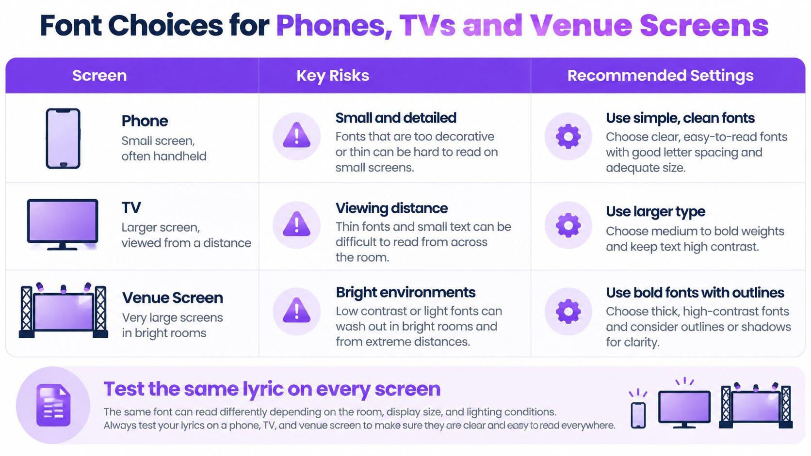
Readability research points the same way. Larger print size improves reading speed overall, and a larger x-height gives a modest gain when increasing the size isn't practical, according to the 2025 review of readability studies. That review also found no single typeface or text size optimises readability for everyone, and that familiarity with a face may matter more than whether it has serifs. Which is why regular-width letters beat condensed ones for anything read at a glance.
Layout does half of this work for you. Single puts one large centred line on screen, which suits televisions and venue screens where the audience sits far away. Karaoke's two lines fit phones and channel videos where more text has to fit in frame, and Scrolling helps on a long song where viewers want the coming line in view. An audience skews older more often than creators expect, so pick one clear, well-spaced family and test it with real viewers instead of trusting a "dyslexia friendly" label.
Survey data backs the instinct to prioritise legibility over novelty: 76 percent of designers said they prioritise readability and accessibility when selecting fonts, according to Monotype's 2024 Global Font Use survey.
Then run the test. Watch the same lyric passage on a phone and on a television at the distance people sit, and mark every line that needs a second look. Those marks are your font decisions.
Test the Font Look Then Save a Preset
A font that looks sharp in the editor can still fail when a singer hits a long chorus line on a bright venue screen. Treat this last pass like a soundcheck: one chorus, the export size, and the screens people watch on.
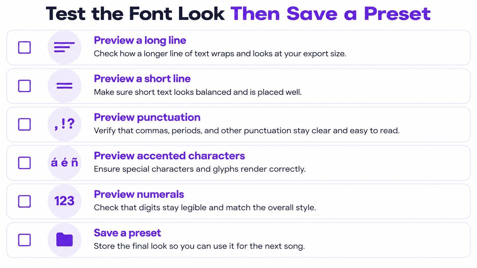
Work through the same lyric passage in this order.
- Preview a long line and a short line at the export size, plus punctuation and accented characters. Commas and periods disappear first when tracking is tight, and accents show a face that is substituting glyphs.
- Check numerals and any mixed-language line. A fallback face that reflows a line also moves the karaoke highlight with it.
- Preview in a phone-sized frame as well as the full output size. The smaller frame is where most viewers first meet the video. A television or venue screen is where distance exposes thin strokes.
- Watch a full chorus for clipping, overlap and highlight drift. Nudge a word's edge by 10 ms when the wipe lags the singer.
- Export once and compare. Confirm the font, outline and wipe match the preview. Export with the vocal for a lyric video, or without it for a karaoke version.
The usual failures are short and fixable. A missing glyph. A synthetic bold or italic the family does not really include. A fallback that reflows a line. Too many display faces loaded at once, which makes the preview stutter while you are judging timing.
Why weight and variant count matter: the CSS Fonts Module Level 4 notes that font resources load lazily, so a browser only fetches the faces your styles actually reference. Declaring a huge library does not cost you anything until you use it, but a project that leans on a dozen weights still pays the rendering price.
Once the frame passes, save the whole look as one preset: title font, lyric font, size, spacing, outline and wipe together. Presets and templates are available when you subscribe or buy credits, and they apply a proven look to the next video in one click. This guide to template usage walks through reusing a saved set of settings.
Open MyKaraoke Video, load the song you are working on, and set the font from more than 1,500 options along with text, wipe and outline colors. When that chorus passes your phone preview and your television preview, save the look as a preset and apply it to the next song in one click. Export at 1080p with or without the vocal track.
