A good subtitle font is all about one thing: clarity. Viewers need to read and understand the words instantly, without even thinking about it. That's why classics like Arial, Helvetica Neue, and Roboto are go-to choices. Their clean, simple lines get the job done, making for a smooth, seamless viewing experience.
What Defines a Good Subtitle Font
Before you start scrolling through font libraries, let's talk about what actually makes a font work for on-screen text. It’s not about finding the coolest or most artistic design. In fact, it’s the opposite. A great subtitle font is practically invisible.
Think of it as a clear window between the dialogue and the viewer. It should enhance understanding without ever drawing attention to itself. The goal is a font that feels like a natural part of the video, not a clunky layer slapped on top.
This has never been more important. With 1.5 billion people globally experiencing some form of hearing loss, subtitles are essential for accessibility. And it's not just about hearing loss—people's viewing habits have changed. A staggering 85% of Facebook users watch videos with the sound off. Good, clear text isn't just a nice-to-have anymore; it's a must. On top of that, research shows that 68% of people simply find subtitles make video content easier to follow.
Key Traits of Effective Subtitle Fonts
So, what separates the good from the bad? The best fonts for subtitles are all about function over fashion. They're designed specifically for how the human eye scans and processes words in a dynamic, fast-moving video. Unmistakable clarity, balanced weight, and clean lines are the non-negotiables.
It's pretty simple when you think about it. Imagine trying to read a fancy, looping script font during a fast-paced action scene—it would be a nightmare. That's why professionals stick with fonts built for pure legibility.
The ultimate test of a good subtitle font is simple: if you don't notice it, it's doing its job perfectly. Its primary role is to convey information transparently, enhancing the viewing experience without becoming the center of attention.
To make this crystal clear, here’s a quick breakdown of what to look for and what to avoid.
Effective vs Ineffective Subtitle Font Characteristics
This table compares the core characteristics that make a font great for subtitles versus those that can ruin the viewing experience.
| Characteristic | Good Subtitle Font (Effective) | Poor Subtitle Font (Ineffective) |
|---|---|---|
| Legibility | Clean, simple letterforms. Easy to read at a glance, even at small sizes. | Overly stylized, decorative, or complex letterforms. Difficult to decipher quickly. |
| Weight | Medium or semi-bold. Thick enough to stand out against various backgrounds. | Too thin (gets lost) or too bold (letters blur together). |
| X-Height | High x-height. The lowercase letters are tall relative to the uppercase letters. | Low x-height. Lowercase letters are short, making them harder to read. |
| Spacing | Generous letter spacing (tracking) and word spacing. Avoids crowding. | Letters are too tight (kerning) or too far apart, disrupting reading flow. |
| Style | Sans-serif is the standard. Simple, no extra flourishes on the letters. | Script, handwritten, or novelty fonts with distracting embellishments. |
In short, you're looking for a workhorse font, not a show pony. Always prioritize readability above all else.
Making the Right Font Choice
Beyond pure legibility, the right font should also match the vibe of your video. A sleek, modern font is a great fit for a tech tutorial, while a slightly softer, more rounded font might feel more at home in a fun karaoke video for kids.
Your font choice is a key part of your video's design. It needs to work in harmony with other elements, like the video background for your lyrics. Getting this right creates a polished, professional look that keeps your audience hooked from the first note to the last.
The Hidden Rules of On-Screen Legibility
Ever wonder why some on-screen text is a breeze to read while other fonts make you squint? It's not just about picking something that "looks good." There are some subtle, almost invisible, rules at play that make certain typefaces work better than others. Think of it like a pro athlete's form—the tiny mechanical details are what separate good from great. For a good subtitle font, these mechanics are everything.
One of the biggest factors is something designers call x-height. Just picture the lowercase letter 'x'. The x-height is simply how tall that 'x' is compared to a "tall" letter like 'H' or 'T'. Fonts with a larger x-height feel more open and are much easier to read, especially on a small screen or from across the room. The main body of each letter is just bigger and clearer.
Anatomy of a Readable Font
Spacing is another one of those hidden rules. The space between each letter, technically called tracking, needs to be just right. If the letters are all jammed together, they turn into a blurry mess. But if they're too far apart, your brain has to work overtime just to connect them into words. A well-made font has already found that perfect sweet spot.
Font weight makes a huge difference, too. A super-thin font can easily get lost against a busy video background. On the flip side, a font that’s too bold and chunky can cause letters to bleed into each other, destroying their unique shapes. A medium or semi-bold weight is usually the Goldilocks choice—strong enough to be seen, but clean enough to be clear.
This infographic breaks down what really goes into making a font work well on screen.
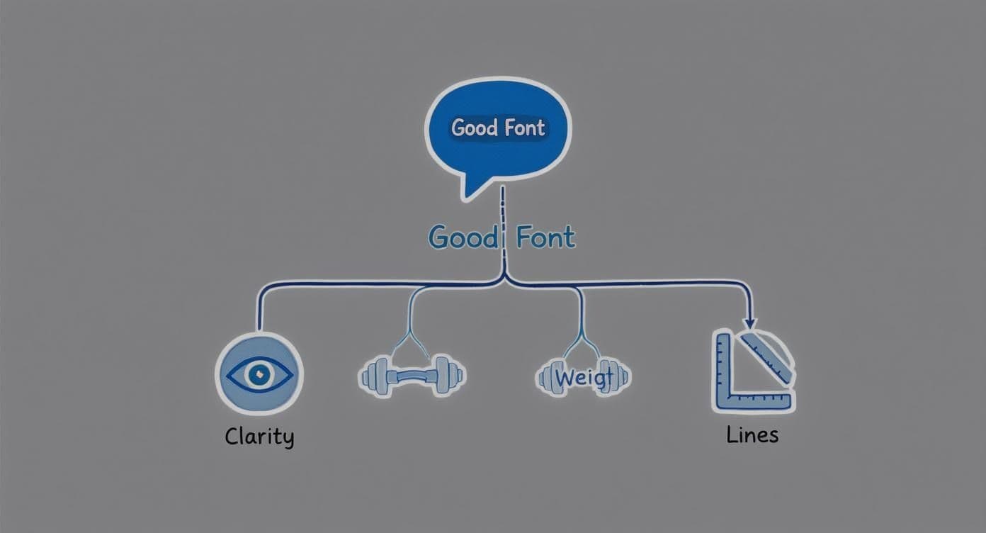
As you can see, it's a careful balance. Clarity, the right weight, and simple, clean lines all have to work together to create a smooth reading experience for the viewer.
Why Designers Prioritize Legibility
These principles aren't just for show; they have a massive impact on the viewer's experience and, just as importantly, accessibility. That's why designers are obsessed with them.
In fact, a recent survey found that a whopping 76% of creative professionals put readability and accessibility first when picking a font. The same study showed that sans-serif fonts are still the go-to choice for on-screen text worldwide, which tells you a lot about what works in practice.
Ultimately, legibility is about reducing cognitive load. A great font lets the viewer's brain absorb the meaning of the words instantly, instead of wasting even a millisecond trying to figure out what the letters are.
Getting these fundamentals right is the key to making smart choices, no matter what you're designing. You can dig deeper into these ideas by exploring the best fonts for posters and how to pick standout type for print. The same core rules of clarity and visual hierarchy apply, whether it's on a screen or a piece of paper. Once you master these hidden rules, you're no longer just picking a font—you're choosing the right tool for the job.
Top Subtitle Fonts That Pros Actually Use
Knowing the theory is one thing, but seeing what the pros actually use is a fantastic shortcut to making a great choice. While thousands of fonts are out there, you’ll see the same handful pop up in professional subtitles and karaoke videos again and again. Why? Because they just work. These fonts nail the balance between clarity, versatility, and on-screen performance.
The undisputed champions are often the old standbys. Fonts like Helvetica Neue and Arial are trusted worldwide because they’re neutral, incredibly easy to read, and available everywhere. Think of them as the reliable sedans of the font world—not flashy, but they’ll get your message across clearly and safely every single time, on pretty much any device imaginable.
Modern Classics for Digital Screens
As we all started watching more video on our phones and laptops, a new generation of fonts designed specifically for screens came into the spotlight. Roboto, developed by Google, is a perfect example. It was literally engineered to look crisp and clean on everything from a giant TV to a tiny smartphone screen, making it a stellar modern choice for any video.
In the same vein, Lato brings a friendly, warmer feel to the table without sacrificing an ounce of the professional-grade clarity you need for subtitles. Its semi-rounded details give it a little personality, but its core structure is all about legibility. It's no wonder these have become go-to options for creators who need a font that feels current and performs flawlessly online.
This preference for clean, sans-serif fonts isn't just a subtitle thing; it reflects a much bigger trend. A study of web font usage found that a whopping 85% of websites use sans-serif fonts. The same study showed designers favor larger font sizes (94%) and heavier weights (82%) to make text easier to read—the exact same principles we need for great on-screen text. You can dive deeper into the data on how designers use fonts to enhance digital readability.
Dynamic Fonts for Karaoke and Lyric Videos
Karaoke and lyric videos are a whole different ballgame. The font still needs to be exceptionally clear for quick reading, but it also has to have a bit more personality to match the music's energy. A standard, run-of-the-mill subtitle font can feel a little flat for a high-energy sing-along.
This is where more dynamic, condensed sans-serifs really get to shine. Here are two fantastic options that hit the mark:
- Oswald: This font is tall and narrow, which is a neat trick that lets you fit more words on a line without shrinking the text or losing impact. Its bold, confident look is perfect for rock anthems or big pop hits.
- Bebas Neue: Another incredibly popular condensed font, Bebas Neue is all-caps by design and has a strong, clean vibe. It’s perfect for making a statement and is ridiculously easy to read at high speeds—a must when lyrics are flying by.
A great karaoke font strikes the perfect balance between personality and performance. It has to be engaging enough to fit the song's mood but legible enough that singers never miss a beat.
Honestly, you can't go wrong choosing one of these proven fonts. Whether you need the quiet reliability of Arial for a documentary or the bold energy of Oswald for a karaoke banger, these options give you a professional foundation to build on.
Styling Subtitles for Readability and Impact
You could pick the perfect font, but if it's styled poorly, it’s all for nothing. Think of styling as the final polish that makes your text readable against any background, whether it's a dark, moody concert scene or a bright, chaotic beach party. Get it right, and your lyrics will pop without distracting from the video itself.

There’s a reason you see this everywhere: white text with a thin black outline (or stroke). It’s the industry standard for a reason. This simple combination creates a high-contrast barrier that separates the letters from any color imaginable, making them legible no matter what’s happening on screen.
Another incredibly effective technique is to place your text inside a semi-transparent black background box. This gently mutes the video behind the words, giving them a clean surface to sit on while still letting the viewer see the action.
Mastering Color Contrast and Effects
While plain white text is a safe bet, you can absolutely play with color—you just have to be smart about it. The golden rule is to maintain high contrast. You also need to avoid color combinations that are notoriously difficult to read, especially for people with color vision deficiencies.
Here are a few essential do's and don'ts to keep in mind:
- Do: Apply a subtle drop shadow. This can gently lift the text off the background, giving it a nice bit of depth.
- Don't: Ever use bright, vibrating color pairs like red on blue or green on red. This is a recipe for eye strain and a huge accessibility problem.
- Do: Stick to a single, highly readable color for the main body of your text.
- Don't: Go overboard with heavy outlines or thick shadows. It can make the letters look clunky and actually decrease legibility.
The whole point of styling is to solve a single problem: making text readable over a constantly changing background. The simplest solutions—a clean outline or a background box—are almost always the best.
Of course, applying these rules manually can be a bit of a grind. If you're looking to speed things up, some of the best auto captions apps can handle a lot of the heavy lifting for you, automating much of the styling work.
In the end, even the best font needs smart styling to truly shine. For anyone making karaoke videos, mastering these visual techniques is a huge part of the process when you add lyrics to your video. It ensures every single word is clear, impactful, and easy for your audience to sing along to.
Best Practices for Subtitle Size and Placement
Choosing the perfect font is a great start, but it's only half the battle. How those words actually appear on screen—their size and position—is just as crucial for a good viewing experience. Get this right, and your text feels like a natural, helpful part of the video. Get it wrong, and it’s just a distraction.
Think of it like adjusting your speaking volume for different places. You wouldn’t shout in a library or whisper at a rock concert. In the same way, subtitles meant for a huge TV screen need a different approach than those designed for a smartphone held just inches from your face. The goal is always the same: make the text big enough to read easily, but not so big that it overpowers the video itself.
Finding the Right Size and Position
You're aiming for effortless readability. Viewers shouldn't have to squint, pause, or rewind just to catch what was said. This is all about striking a careful balance between being visible and being subtle.
To do this, you have to understand the safe area. This is the central part of the screen where you can be absolutely sure your text won't get chopped off by the bezels of different TVs or the quirks of various devices. For subtitles, this safe zone is almost always the lower third of the screen. Placing text here keeps it out of the way of the main action while making it easy for the viewer's eyes to drop down and read.
Positioning subtitles within the lower-third safe area is a non-negotiable industry standard. It ensures that critical on-screen action is never obscured and that the text is consistently visible across all devices, from widescreen TVs to vertical mobile formats.
Mastering Line Length and Timing
Okay, so you know where to put the text. Now you have to decide how much to show at once. Cramming too much text onto a single line is a surefire way to tire out your audience. Finding the right length is a delicate art.
Luckily, there are some time-tested guidelines that the pros stick to:
- Characters Per Line: Keep your lines to a maximum of 42 characters. This simple rule stops the viewer's eyes from having to dart back and forth, which can be exhausting.
- Number of Lines: Never show more than two lines of text at a time. Anything more than that just looks cluttered and becomes incredibly hard to read before it disappears.
- Perfect Timing: In a standard video, subtitles should pop up the instant someone starts speaking and vanish the moment they stop. For karaoke, the stakes are even higher—the timing has to be perfectly synced with the melody to guide the singer along.
These aren't just random rules; they're based on decades of research into reading speed and viewer comfort. When you nail the size, placement, and timing, your subtitles stop feeling like an add-on and start supporting the video in a powerful way.
How to Apply Your New Font in MyKaraoke Video
All this font theory is great, but what really matters is putting it into practice. Let's walk through exactly how to take that perfect font you've chosen and apply it using MyKaraoke Video. It's a surprisingly simple process that gives you a ton of creative control without any of the usual technical headaches.
First things first, get your audio and lyrics loaded into the editor. From there, you'll want to head straight to the “Design” tab. Think of this as your command center for everything visual in your video. The font selection menu is right there, ready for you to pick the perfect typeface.
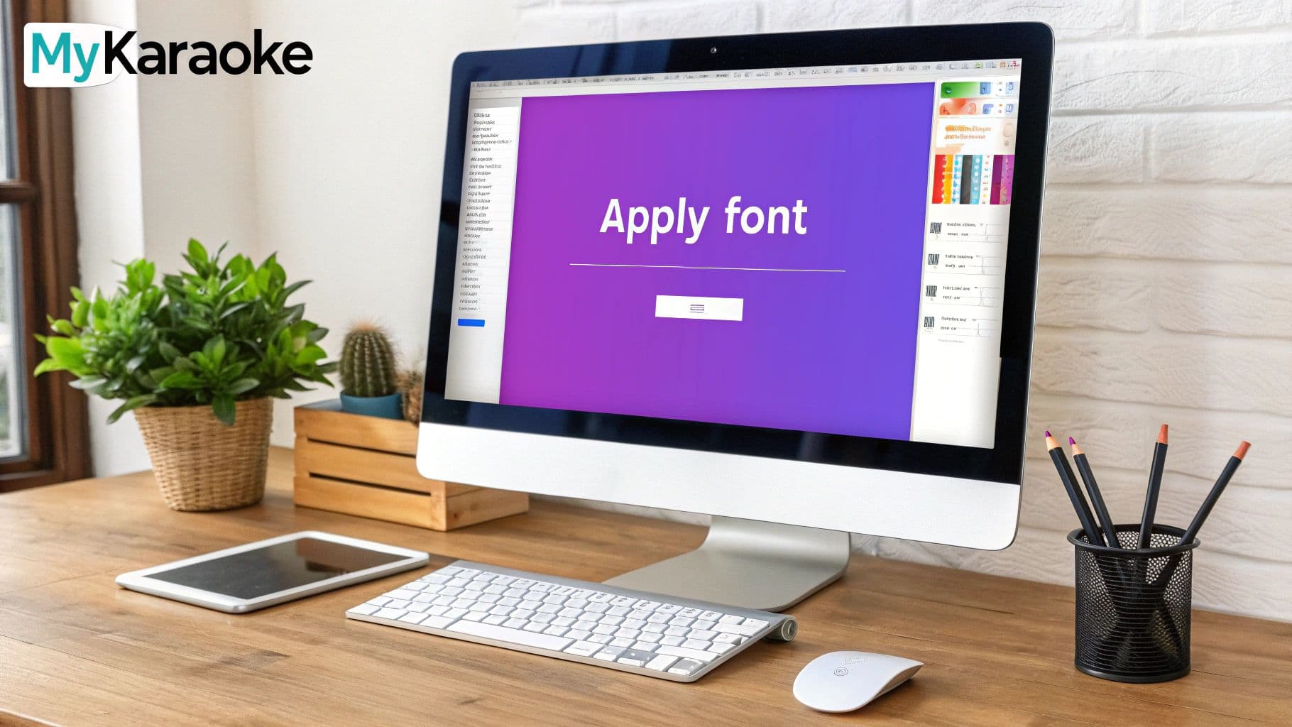
As you can see, the customization panel lays everything out clearly—font, color, and effects are all in one easy-to-find spot.
Fine-Tuning Your Text
Once you've selected a good subtitle font, the real fun begins. Now you get to dial in the details to make sure your lyrics pop off the screen.
- Size and Color: Play around with the sliders and color pickers. You can adjust the text size to look good on any screen and choose a color that creates strong contrast with your background video.
- Styling Effects: This is where you can add that professional polish. Outlines and shadows are your best friends for readability. A thin, black outline around white text is a timeless trick that makes lyrics legible over even the busiest backgrounds.
- Real-Time Preview: The best feature here is the instant preview. As you tweak the settings, you’ll see the changes happen live. No more guessing what the final result will look like.
Remember, the main goal is to make the lyrics effortless to follow. Use these styling tools to solve any potential reading issues before you hit that export button.
This level of hands-on control is what makes the whole process so effective. If you want to dive even deeper, you can learn how to create professional lyric videos in minutes with the MyKaraoke Video premium editor. Spending a few extra moments getting these settings just right can transform your project from a basic lyric video into a genuinely fun and engaging karaoke experience for everyone.
Wrapping Up: Your Subtitle Font Questions Answered
Alright, let's tie all this together by hitting some of the most common questions that pop up when picking a good subtitle font. Think of this as a quick-fire round to clear up any lingering doubts before you dive into your own projects.
This is your final check-in to make sure your on-screen text is clear, professional, and easy for everyone to read.
What’s the Most Universally Readable Subtitle Font?
If you're looking for one font to rule them all, Helvetica Neue is about as close as you can get. It’s a workhorse for a reason—its design is incredibly clean, it stays legible on screens of any size, and it has a neutral feel that doesn't distract from the video.
But you've got other fantastic options, too. Roboto and Arial are also go-to choices for professionals because they're universally available and just plain work. You really can't go wrong starting with any of these three.
Should I Use a Serif or Sans-Serif Font for Subtitles?
For anything on a digital screen, sans-serif fonts are almost always the right call. The clean, simple lines of sans-serif letters are just easier for our eyes to scan quickly on-screen, which is exactly what you need for subtitles. This holds true whether you're watching on a huge TV or a tiny phone screen.
The numbers back this up: over 85% of websites use sans-serif fonts for their main text. When it comes to on-screen clarity, it’s best to stick with what’s been proven to work.
When we talk about accessible subtitles, it really comes down to two things: contrast and clarity. Your main goal is to make sure the text can be read easily over any kind of background, so it works for every single viewer.
How Do I Make My Subtitles More Accessible?
Making your subtitles accessible is simpler than you might think. Start with a clean, large sans-serif font, and from there, your main job is to nail the contrast.
Here are the two most effective, tried-and-true methods for perfect legibility:
- Use white text with a thin black outline. This is the classic approach that makes text pop without being distracting.
- Place your text inside a semi-transparent black box. This creates a consistent, readable background for your words, no matter how chaotic the video gets.
Either of these techniques will ensure your text stays perfectly clear, whether the scene behind it is bright, dark, or full of motion.
Ready to put all this knowledge into action? With MyKaraoke Video, you can apply these font and styling principles in just a few clicks to create amazing karaoke videos. Start creating your professional lyric video today.