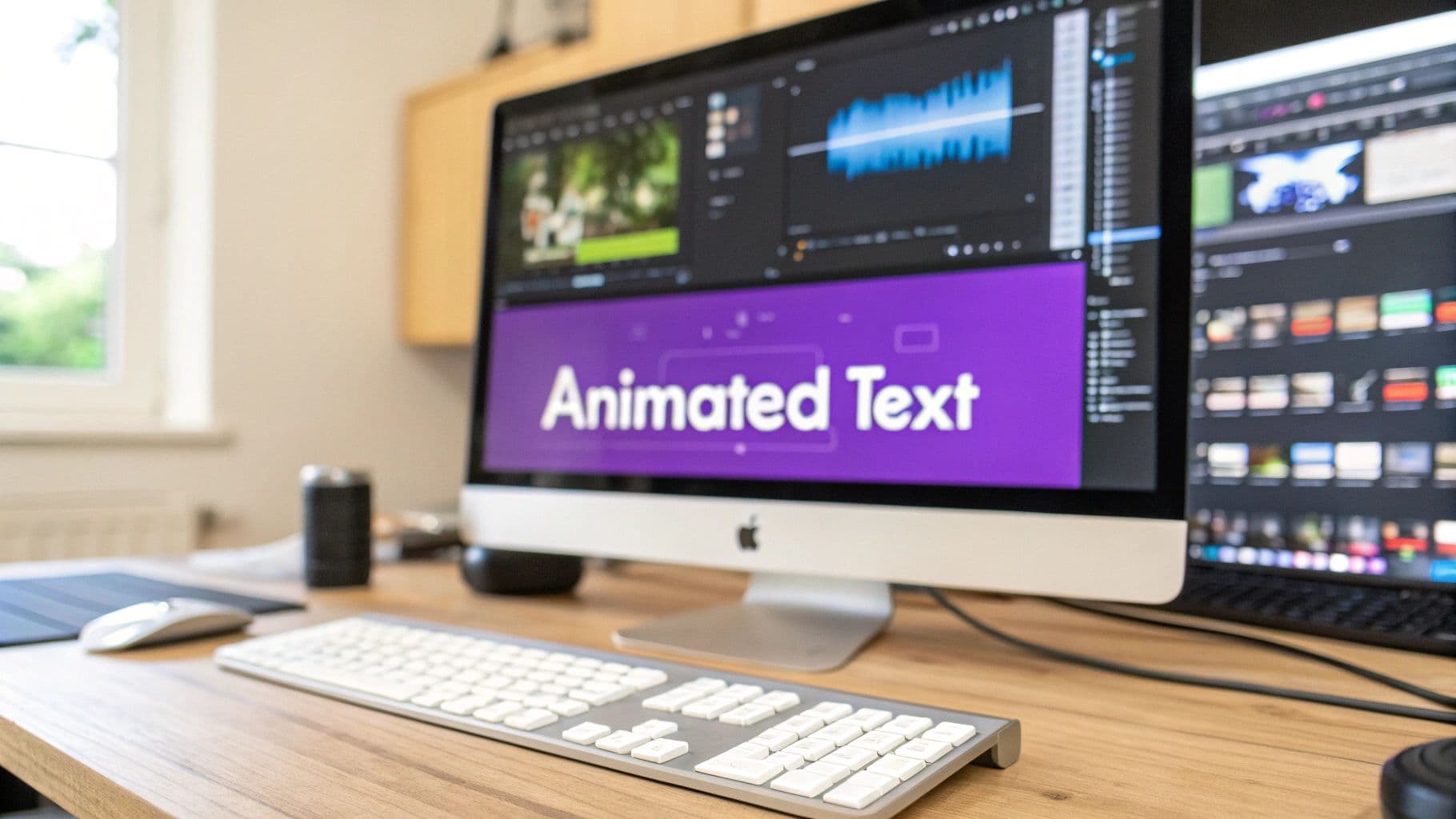
Animated text isn't just about making words move on a screen; it's about breathing life into them. Instead of a static title sitting there, you make it do something—fade in, pop, or type itself out. It's a surprisingly simple trick that instantly makes your videos look more professional and far more engaging.
Why Animated Text Is Your Secret Weapon
Let's be honest, in a fast-scrolling world, plain text is easy to ignore. Animated text, on the other hand, catches the eye. It adds a layer of motion and visual flair that stops people in their tracks. This isn't just about looking cool; it's a smart way to direct your viewer's attention and make sure your most important points really land.
Imagine a customer testimonial where the most powerful phrases animate as they're spoken. Or think about a data-heavy presentation where key numbers build on screen one by one. That’s the real power of animated text for videos: it turns flat information into an active experience that keeps your audience hooked.
Boost Engagement and Keep Viewers Watching
Our eyes are naturally drawn to movement. When text animates, it gives the brain something to focus on, keeping viewers tuned in for longer. That extra watch time is gold on platforms like YouTube and Instagram.
The data speaks for itself. Viewers tend to retain a staggering 95% of a message when they watch it in a video, compared to a mere 10% from reading text. This is a huge reason why around 59% of marketers have embraced animated videos to explain their products, using what's called kinetic typography to make complex ideas feel simple.
Kinetic typography isn't just about making words move; it's about making your message move people. It directs attention, emphasizes meaning, and turns a simple video into a memorable story.
Simplify Complex Information
Got a complicated topic to explain? Animated text is your best friend. You can reveal information piece by piece, guiding your audience through the steps without overwhelming them. In a how-to video, for example, animating each step as you explain it visually reinforces what you're saying.
- Highlight Key Takeaways: Make important stats or quotes pop.
- Guide the Narrative: Use text as a signpost to introduce new sections or speakers.
- Enhance Accessibility: When you animate subtitles, you make your content easier for everyone to follow, regardless of their hearing ability or environment.
This table gives a clearer picture of how much of a difference this technique can make.
Impact of Animated Text on Viewer Engagement
| Metric | Static Text Overlay | Animated Text (Kinetic Typography) |
|---|---|---|
| Viewer Retention | Moderate; viewers may skim or skip ahead. | Higher; motion holds attention and guides pacing. |
| Message Recall | Lower; text can blend into the background. | Significantly higher; key points are emphasized. |
| Watch Time | Tends to be shorter, especially on longer videos. | Increased; viewers are more likely to stay engaged. |
| Perceived Quality | Can look basic or unprofessional if not designed well. | Elevates production value, making content feel polished. |
As you can see, the simple act of animating your text can fundamentally change how your audience interacts with and perceives your content.
Elevate Your Brand and Professionalism
A slick, well-executed animation adds a layer of polish that screams professionalism. It shows you care about the details. Over time, a consistent animation style can even become a core part of your brand identity, just as important as your logo or color scheme.
For example, when you use tools like this Blog to Instagram Reels converter to turn written articles into short videos, animated text becomes essential. It’s what carries your message and ensures the final product looks sharp and on-brand. Getting this right isn't just an aesthetic choice; it’s about making your message stick.
Choosing the Right Animation Style for Your Brand
Let's be honest: not all text animations are created equal. The style you pick can either be the secret sauce that makes your message pop or a total distraction that muddies the waters. The real craft is in matching the animation to your brand’s personality, the video's purpose, and the feeling you want your audience to walk away with.
Think about it this way. A high-energy social media ad for a new pair of sneakers practically begs for something bold and dynamic. A quick pop-up, a snappy bounce, or even a trendy glitch effect can stop a scroller in their tracks. But try using that same bouncy text in a serious corporate video explaining quarterly earnings? It would feel completely out of place, even unprofessional. For that, a gentle fade or a smooth slide-in is all you need.
Aligning Animation with Your Brand Voice
Before you even think about effects, take a step back and consider your brand's voice. Is it playful and fun? Serious and authoritative? Maybe it’s calm and minimalist. The motion of your text should be an extension of that personality, just as much as your logo or color palette.
Here are a few real-world examples to get you thinking:
- For a high-end luxury brand: You’re selling elegance, so your animations should whisper, not shout. Think subtle, slow-moving effects like a soft fade or a gentle reveal. The movement should feel sophisticated and effortless.
- For a kid-friendly YouTube channel: This is where you can have some fun! Bright, bouncy, and energetic animations are the name of the game. A little wiggle on a title or a pop effect for a call-out makes the content feel way more engaging for a younger audience.
- For an educational or news-focused channel: Here, clarity is king. The goal is to deliver information without any distracting flair. A clean slide-in from the side or a classic typewriter effect gets the job done, keeping the focus squarely on the content.
Your animation style is a non-verbal cue that sets the tone instantly. A mismatch can create a weird disconnect, weakening your message before the viewer even has a chance to read the words.
Getting this right is what separates a video that feels thrown together from one that looks polished and intentional.
Matching the Animation to the Video's Goal
Beyond your brand’s vibe, you have to think about what job the text is actually doing in this specific video. Are you revealing a new product? Highlighting a key statistic? Simply adding subtitles? The goal itself should heavily influence the kind of animation you choose.
Kinetic typography—which is just a fancy term for moving text—is a powerful tool for setting a mood.
This famous example from an Alfred Hitchcock film uses dramatic, fast-paced animations to build suspense and tension. It's brilliant for a title sequence, but that same chaotic energy would completely overwhelm a simple how-to tutorial.
A Quick Framework for Making Your Pick
To cut through the noise, I always come back to three core elements when I'm working on animated text for videos. If any one of these is off, the whole thing can feel a bit wobbly.
| Element | What to Ask Yourself | Example Animation Style |
|---|---|---|
| Pacing | Does the animation's speed match the video's rhythm? A slow, thoughtful video needs slow animations. | Slow Zoom for a documentary; Flash for a product reveal. |
| Complexity | Is the animation simple or busy? Overly complex effects are just visual clutter, especially over a detailed background. | Clean Title Slide for clarity; Glitch Effect for a punch of style. |
| Direction | Does the movement guide the viewer's eye where you want it to go? Text should flow logically on the screen. | Slide-In from Left to follow natural reading direction; Rise Up to emphasize a final point. |
This way of thinking helps you move past just picking an effect that "looks cool" and toward choosing one that actively serves the story you're trying to tell. When you’re in a tool like MyKaraoke Video, you’ll see dozens of styles. Before you click, just ask yourself: does this movement feel like my brand? Does it help or hurt the message?
Ultimately, the best animation is the one you don't even notice. It should enhance the experience so seamlessly that the viewer just absorbs the information more effectively. Nail this, and you’re well on your way to creating truly professional-looking videos.
Mastering Timing and Rhythm in Your Animations
Creating slick animated text is one thing, but making it feel alive? That's a whole different ballgame. The real magic happens when your text animations move in perfect harmony with your video's audio and overall pace. This synchronization is what separates a polished, professional video from one that just feels… off.
Great timing isn’t just about making text appear on screen. It’s about weaving it into the story. Whether you’re syncing a title to a dramatic beat drop or having a keyword pop up the exact moment it's spoken, precision is everything. This perfect marriage of sight and sound pulls the viewer in and makes the whole experience much more satisfying.
Syncing Text with Audio Cues
The foundation of great timing is simply listening. Before you even think about touching an animation setting, play your audio track and pinpoint the key moments. These could be anything from the downbeat of a song to a specific word in a voiceover.
- For Music-Driven Videos: You're working with the beat. Does your text need to pulse with the rhythm? Or should it make a grand entrance on a major musical cue, like a chorus or a cymbal crash?
- For Voiceover-Led Content: The spoken word is your guide. The goal here is to have the animated text reinforce what's being said, not compete with it. A key phrase can fade in gently as it's spoken, adding a layer of visual emphasis without being distracting.
With a tool like MyKaraoke Video, this process gets a lot easier. Its AI-powered features can automatically align lyrics with the music, handling the heavy lifting of that initial sync. This gives you a fantastic starting point, freeing you up to fine-tune the rhythm and feel. For anyone wanting to really master the craft, digging into how to sync audio with video will give you an even greater level of polish.
The Power of Easing for Natural Motion
Ever seen an animation that just felt clunky and robotic? It was probably missing "easing." In the real world, things don't just start and stop moving instantly; they accelerate and decelerate. Easing mimics this natural physics, making your animations feel fluid and organic.
- Ease-In: This makes an animation start slow and then speed up. It’s perfect for building anticipation or introducing an element smoothly.
- Ease-Out: The opposite of ease-in, this has an animation start quickly and then slow to a gentle stop. It feels so much more natural than an abrupt halt.
Using ease-in and ease-out is a subtle but incredibly powerful technique. It's the difference between text that just appears and text that gracefully arrives, making your animated text for videos feel significantly more professional.
By applying these simple curves, your text won't just slam onto the screen; it will glide, bounce, or settle in a way that’s far more pleasing to the eye.
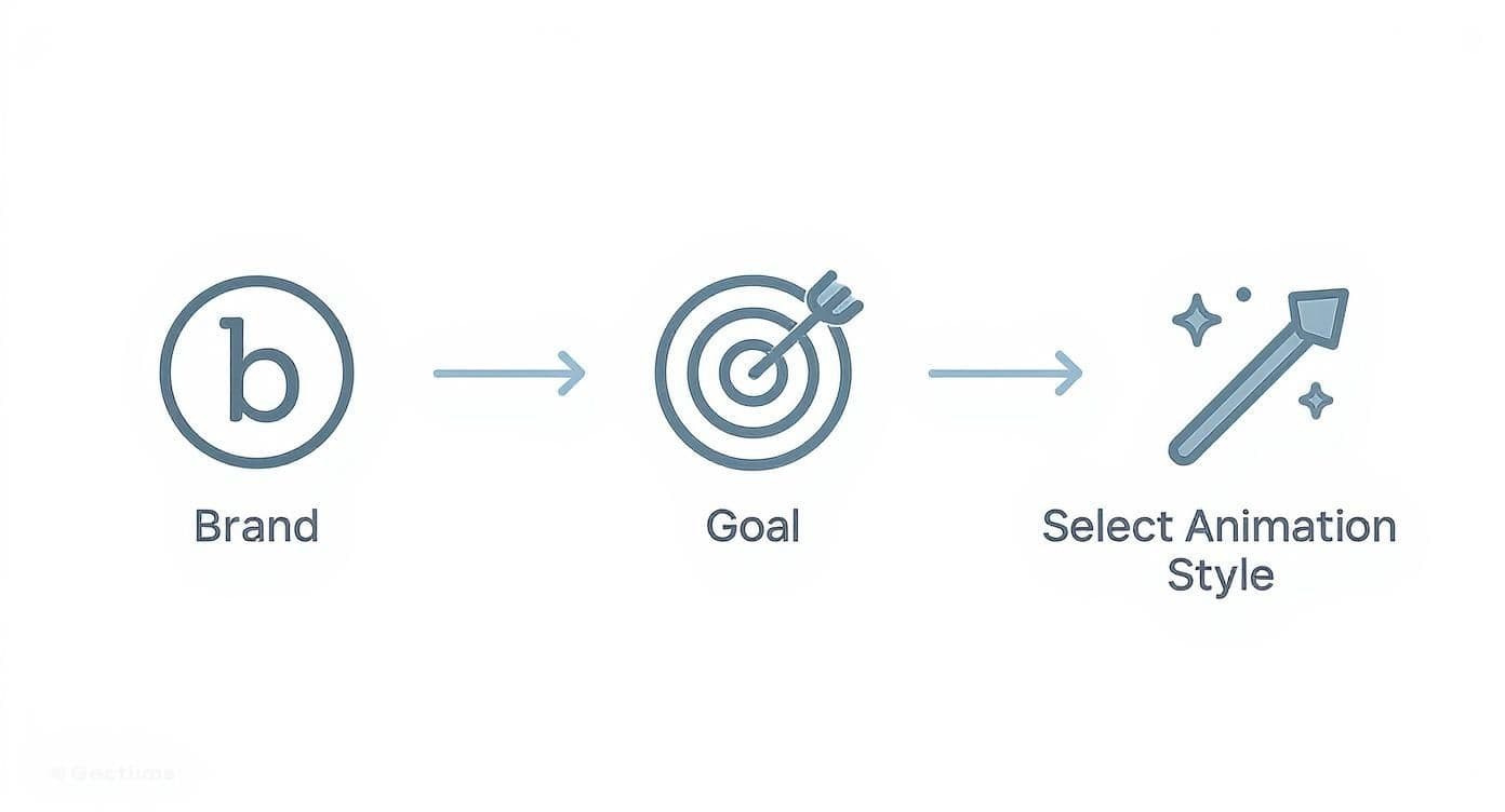
This infographic walks through the core things you need to think about when picking a style, even before you get to the timing.
The key takeaway here is that your animation's rhythm and timing should always support the brand identity and video goals you’ve already established.
Pacing Your Text for Readability
Perfect timing also means knowing exactly how long to keep text on screen. If it disappears too quickly, your audience will miss the message entirely. But if it lingers too long, you'll kill the video’s momentum.
A good rule of thumb is what I call the "one-and-a-half times" rule. The text should stay visible long enough for an average person to read it through completely about 1.5 times. This little bit of buffer accommodates different reading speeds without slowing things down.
For a short phrase, 3-4 seconds is often plenty. For a longer sentence, you might need 5-7 seconds. The best way to check? Just watch it back and try to read it yourself. If you feel rushed, so will your audience.
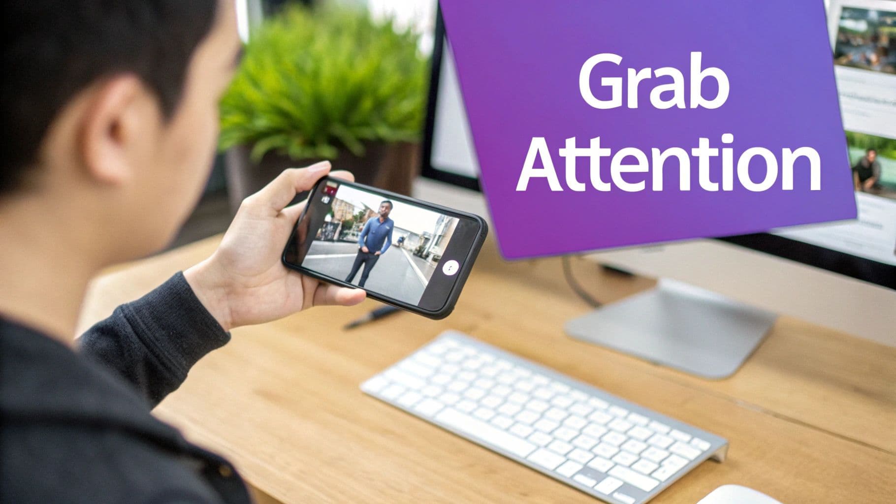
Effective animated text is also a huge part of grabbing attention in those first few critical seconds—the 'hook.' The timing and pacing of this initial text can literally determine whether a viewer keeps watching. If you want to dive deeper into this, check out the ultimate guide to hook rate for Meta Ads. Mastering that initial engagement is absolutely essential for success on social platforms.
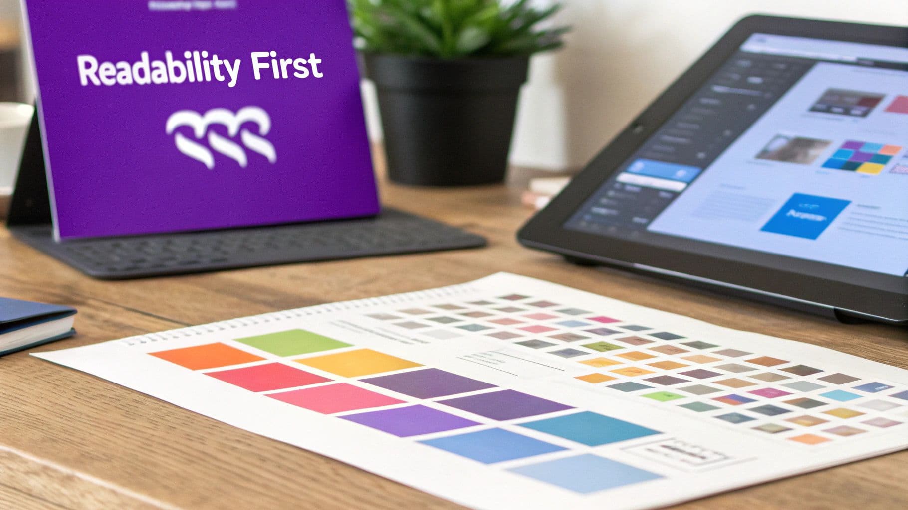
Making Your Words Pop: Typography and Color That Work
A flashy animation is cool, but if nobody can read the words, what's the point? The real secret to great animated text for videos isn't just the movement—it’s the rock-solid foundation of clear typography and smart color choices. Getting these right ensures your message lands perfectly, whether someone's watching on a tiny phone or a giant screen.
Think of your font as the voice of your text. That elegant, swirly script font might look stunning on a static graphic, but the moment it starts moving against a busy video, it becomes an unreadable blur. When it comes to video, simple is almost always better. Clean, no-fuss sans-serif fonts like Montserrat, Lato, or Bebas Neue are industry favorites for a reason: they stay legible at any size and distance.
This isn't just a niche detail; it's a huge part of modern visual communication. The animation and VFX market is exploding, projected to jump from USD 415.30 billion in 2025 to a mind-boggling USD 691.69 billion by 2034. That growth is all about telling compelling stories visually, and readable text is a massive part of that.
Choosing a Font That Can Move
When you're picking a font, your number one priority should be readability in motion. Before you fall in love with a typeface, ask yourself how it will hold up once it's animated. Super-thin fonts can flicker or get lost against a complex background, while heavy, condensed fonts can feel clunky and hard to read at a glance.
Here’s a pro tip: always test your top font choices over a real snippet of your video. Does it stay clear during the chaotic, fast-moving parts? If you find yourself squinting, it’s the wrong font. For a deeper dive into what makes a typeface work on screen, our guide on choosing a good subtitle font has some great insights that apply to any text you put in a video.
The best font for animated text is one you don't even notice. It should deliver the message so smoothly that the viewer just gets it without ever thinking about the letters themselves.
The Make-or-Break Role of Color and Contrast
Your color palette is just as crucial as your font. The golden rule here is high contrast. White text on a black background is the most obvious example, but the principle is universal: light text needs a dark background, and dark text needs a light one. Simple enough, right?
The catch is that video backgrounds are rarely one solid color. They're alive, constantly shifting from light to dark, which can be a real headache. A text color that looks brilliant in one frame might completely disappear in the next.
Don't worry, there are a few tried-and-true tricks to keep your text legible no matter what:
- Add a Subtle Outline: A very thin, dark stroke (1-2 pixels is usually enough) around light-colored text can help it stand out against bright spots in your video without looking tacky.
- Use a Drop Shadow: A soft drop shadow can gently lift the text off the background, adding a touch of depth and making it significantly easier to read.
- Put it on a Shape: Placing your text on a semi-transparent shape (like a rectangle or a bar) gives you a controlled background. This guarantees readability even over the busiest footage.
Font Style and Video Tone Pairing
Matching your font to the video's overall vibe is essential for creating a polished, cohesive piece. If the styles clash, the whole thing can feel off. This quick table can help you make the right call.
| Font Style | Best For (Video Tone) | Common Pitfalls to Avoid |
|---|---|---|
| Sans-serif (e.g., Helvetica) | Modern, clean, corporate, educational | Can feel generic or boring if you just use a default font without thought. |
| Serif (e.g., Times New Roman) | Traditional, elegant, cinematic, authoritative | The thin "feet" (serifs) can flicker or disappear on lower-resolution screens. |
| Script (e.g., Pacifico) | Personal, artistic, casual, romantic | Often hard to read in motion; best used sparingly for just a word or two. |
| Display (e.g., Impact) | Bold, high-energy, attention-grabbing | Can be overwhelming. Great for headlines, terrible for full sentences. |
By carefully combining the right font with smart color and contrast techniques, you’re not just making text that looks good—you’re ensuring it communicates clearly and effectively. It’s this attention to detail that separates the pros from the amateurs and makes sure every single word in your video counts.
How to Export Your Video Without Losing Quality
https://www.youtube.com/embed/-bRIVT34o3s
You’ve spent hours getting your animated text just right, tweaking every fade and timing every bounce. Now for the final hurdle: exporting. This is the moment of truth where all that effort pays off—or falls flat. A botched export can leave you with pixelated text, choppy animations, and a video that looks anything but professional.
Let's walk through how to nail this last step and get a crisp, clean export every single time.
The goal is to hit that sweet spot between stunning quality and a manageable file size. For pretty much any platform you can think of—YouTube, Instagram, TikTok—the gold standard is a 1080p MP4 file. This resolution looks great on everything from a phone screen to a monitor, but it won't create a monster file that takes forever to upload.
Dialing in the Right Export Settings
When you hit that "Export" button in a tool like MyKaraoke Video, you'll be faced with a few options. The default settings are usually a good starting point, but knowing what they do gives you complete control.
- Resolution: Always stick with 1920x1080 (1080p). Anything less and you risk your carefully chosen fonts looking fuzzy and unprofessional.
- Format: Choose MP4 (H.264). It's the universal language of video on the web, supported everywhere. The H.264 codec is a wizard at compressing video files, giving you fantastic quality without the massive file size.
- Frame Rate (FPS): For most videos, 30 FPS is the sweet spot. It delivers smooth playback without being overkill. If you’re working with high-speed footage, 60 FPS might be necessary, but for animated text, 30 FPS is almost always the right call.
Think of these three settings as the foundation for a professional-looking final cut.
What's the Deal with Bitrate?
Bitrate is one of those technical terms that scares people off, but it’s actually pretty simple. It’s the amount of data used for each second of video. More data (a higher bitrate) means better quality but a bigger file.
Too low a bitrate is the #1 reason why animated text and graphics look blocky or pixelated.
For a 1080p video at 30 FPS, a target bitrate between 8 to 12 Mbps (megabits per second) is perfect. This range gives you enough data to keep the edges of your text sharp and your animations smooth, all without bloating your file size. Most tools will have a "High Quality" preset that lands right in this zone.
A common mistake I see is people cranking the bitrate to the max, thinking it will magically make their video better. In reality, it just makes the file huge with no visible improvement for web playback. Find the balance.
Fixing Common Export Headaches
Even with the perfect settings, sometimes things go wrong. If your exported video isn't looking as sharp as you’d hoped, one of these issues is probably the culprit.
1. Blurry or Pixelated Text This is almost always a bitrate or resolution issue. First, double-check that your export resolution is set to 1080p. If it is, your bitrate is likely too low. Bump it up into that 8-12 Mbps range and try again.
2. Gigantic File Sizes If your final MP4 file is enormous, your bitrate is the prime suspect. You’ve probably set it way too high. There’s a point of diminishing returns where more data doesn’t equal better quality. Try lowering it a bit and re-exporting. If you absolutely need to share a large file, learning how to compress a MOV file or another video format can also be a huge help.
3. Laggy or Stuttering Animation This often happens when your project settings don't match your export settings. Make sure your project's frame rate and your export frame rate are the same (e.g., both are 30 FPS). This can also be a sign your computer was struggling during the render—try closing other programs before you hit export.
Getting the technical details right is more important than ever. A recent report found that 60.8% of marketers now use animation in their social media content. The same study showed that high-quality animation helps boost brand recall for 34.2% of marketers and increases click-through rates for another 28.5%. It's clear that a polished, professional export directly impacts your results. You can read more about these animation marketing findings.
Questions That Pop Up When Animating Text
As you get your feet wet with animated text, you’ll quickly run into a few common hurdles. How do you pick the right tool? How do you make sure people can actually read the words on their phones? Getting the timing just right can also feel like a tricky balancing act. Let's walk through some of the questions I hear most often and get you some practical answers.
What Are the Best Free Tools for Animated Text?
This really comes down to what you're trying to accomplish. If you need something quick, simple, and effective, browser-based tools like Canva are a great starting point. They're packed with templates that let you get a polished look without spending hours learning new software.
For those who want a bit more creative freedom, especially for social media, CapCut is a fantastic option. It's surprisingly powerful for a free tool and hits that sweet spot between basic apps and the more intimidating professional software.
And of course, if you want total control and industry-standard power, nothing beats Adobe After Effects. Just know that it has a steep learning curve and a monthly subscription. The best tool is always the one that matches your project's needs and your own skill level.
How Can I Make Sure My Text Is Readable on Phones?
This is a big one. Most people are watching your videos on a small screen, so readability isn't just a nice-to-have, it's essential. The key is to keep things clean and clear.
Stick with bold, sans-serif fonts. Anything too thin, frilly, or complicated just turns into a smudge on a phone. Contrast is also your best friend here. If the video background is busy or shifts from light to dark, your text needs to stand out consistently.
A trick I use all the time is to put a semi-transparent dark box behind the text or add a soft drop shadow. It’s a subtle way to lift the words off the background, making them easy to read no matter what’s going on in the shot.
Finally, don't be shy with the font size, and keep your animations short and punchy. Before you hit publish, always watch the final video on your own phone. It's the only way to know for sure what your audience will see.
What's the Ideal Speed for Text Animations?
Pacing is everything. You need your text on screen long enough for someone to read it, but not so long that it drags down the energy of your video. A good rule of thumb I follow is to leave text up long enough for the average person to read it through about one-and-a-half times.
This little buffer accounts for different reading speeds without boring your faster viewers.
- For short bits of text (2-4 words): 3-4 seconds is usually plenty of time.
- For full sentences: You'll probably want to stretch that to 5-7 seconds.
- When matching a voiceover: The goal is to have the text appear and disappear right in sync with the spoken words. It should feel like it's reinforcing what's being said, not lagging behind or jumping ahead.
When in doubt, give your viewer an extra second. It’s always better to be a little too slow than too fast.
Can Animated Text Actually Hurt My Video's SEO?
I get this question a lot, and the answer is yes and no. Used well, animated text can be a huge boost for your video's SEO. Platforms like YouTube and Instagram want to see high engagement, and good animations can seriously improve metrics like watch time and audience retention.
But the opposite is also true. If your text is hard to read, flashes by too quickly, or is just plain distracting, people will click away. That drop-off sends a negative signal to the algorithm, which can absolutely tank your video's visibility in search and recommendations.
Think of animation as a tool to make your message clearer and your video more engaging, not just a way to add flashy effects. When you focus on improving the viewer’s experience, the SEO benefits will follow.
Ready to create amazing lyric or karaoke videos where the text is perfectly synced? MyKaraoke Video uses AI-powered tools and a simple editor to make it all happen right in your browser. Start bringing your words to life at https://www.mykaraoke.video.